One Room Challenge designers transform rooms with wallpaper, window treatments—and Calico!
If there is any doubt that wallpaper can completely change the character of a room, look no further than these three rooms from recent One Room Challenge designers. They worked magic in a kitchen, a guest room and a master bathroom—using pattern to tie together the colors and décor for a cohesive whole. Calico carries a curated collection of wallpapers to inspire an easy update to any room, in most any style.
What is the One Room Challenge™? This biannual event, sponsored by Better Homes & Gardens, challenges 20 design influencers to transform a space in their home within two months. Each week the designers post about their progress, their setbacks, and at the end, share a final reveal. Several of the One Room Challenge (ORC) designers worked with their local Calico design shop to select wallpaper and fabric for window treatments for their rooms. Let’s meet our designers!
1. Ashley Wilson of Logan, Utah chose a Chinoiserie wallpaper to create a charming kitchen and dining space
Interior designer Ashley Wilson and her BEFORE kitchen—colorful, but lacking cabinets and room for more than four at the dining table.
Photos by Ashley Wilson
Ashley Wilson blogs about her home and family, with a penchant for styling tips and decorating on a budget. For the One Room Challenge, she tore down a stair wall, replaced cabinets and countertops, rearranged appliances and created a larger dining area. Then came the fun part: decorating! “I dreamed of a space that felt like an English cottage—warm and comfy,” recalls Ashley. “Where you could cook and have the best conversations.”
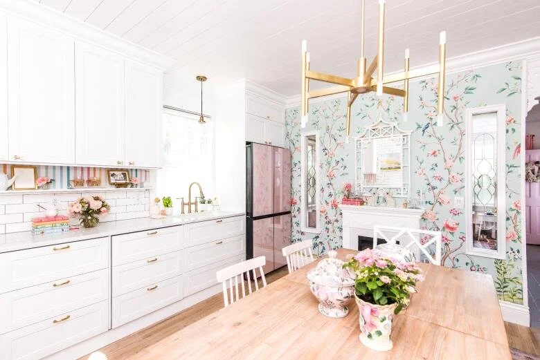
Ashley’s sleek new kitchen with a rose pink refrigerator (!), new white cabinets and a larger dining table. She added an electric fireplace and mantel on the far wall that also features a floral wallpaper mural by Vern Yip from Calico. The leaded glass windows are from a salvage shop and allow natural light from the adjoining room to spill into the kitchen.
Ashley carried the wallpaper mural over to the stair wall at right to tie these spaces together visually. She also added the settee in velvet for more seating at the new dining table.
“The wallpaper is from Calico,” notes Ashley. “I love the roses and birds on the trees! The three panels are each a little different. I’ve been obsessed with Chinoiserie wallpaper for a few years, so I’m excited to bring it into this room.”
Ashley is thrilled with the warm, inviting feel of her new kitchen. Read more about the full reveal in her ORC blog post.
2. Victoria Ford of Cary, North Carolina created a versatile guest room, starting with covering up those “interesting” green walls!
Victoria Ford and the BEFORE room—an unused space she chose to transform to a guest room and adjoining bath. “We’ve been using it as the hoard room since we moved here,” she confesses. “Every homeless item has gone in this room.”
Victoria Ford, a biologist by day and designer by night, blogs as the Prepford Wife to share her “classic with a wink” perspective. The walls, painted an “interesting shade of green,” had to be the first thing to go, recalls Victoria. The bedroom needed to be brightened and lightened—and wallpaper did the trick! “[It] truly transformed the space and instantly gave it a lighter feel,” she observes.
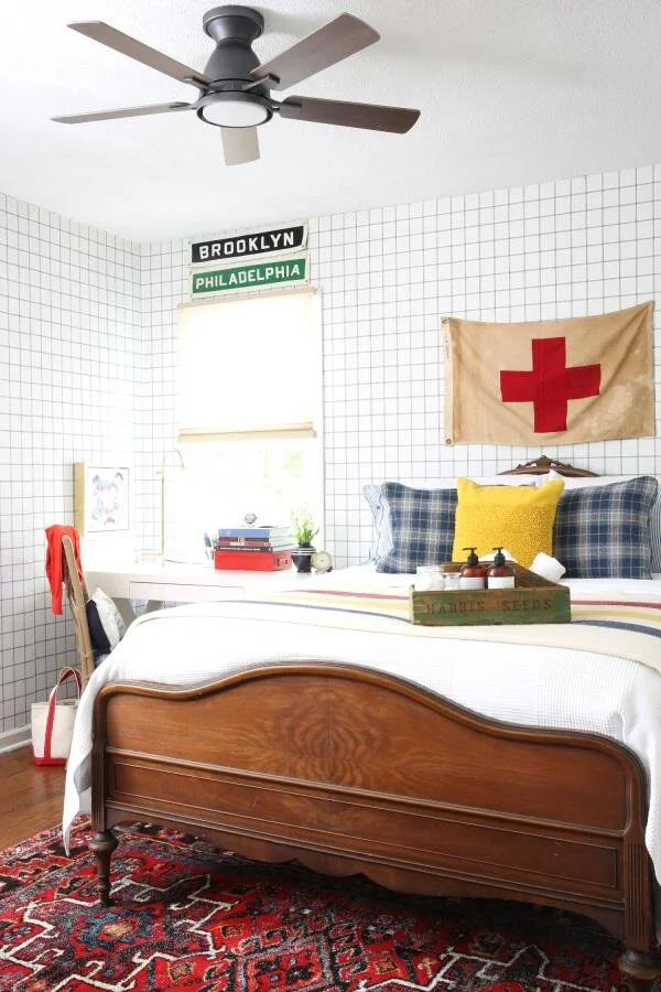
In the AFTER guest room, Victoria chose a Magnolia Home wallpaper, Sunday Best, a grid of blue stitches on white, from Calico.
“This wallpaper was perfect for this space,” says Victoria. “It’s from York Wallcovering, so I knew the quality was going to be A-1, and it’s pre-pasted. If you are a beginner, pre-pasted water-activated wallpaper is your best friend!”
“We like our spaces to work overtime,” notes Victoria. Every guest bedroom needs a desk and working space, she adds. Here the desk also serves as a nightstand—a good solution for a small room.
Victoria’s “Bridal Design” Tips for Decorating
“My rule of thumb when renovating...is the same rule of thumb that brides use at a wedding: something old, something new something borrowed, something blue,” states Victoria. Why? “As someone who is increasingly less preppy in her old age, but still loves the classic things in life, this works for me.” Here is how it applies in Victoria’s guest room:
Something old: “Grounds the space and gives a nod to the home’s age.” The antique French bed from a previous home serves this purpose.
Something new: “Keeps the space from feeling fuddy-duddy and dated.” The wallpaper, lamps and accessories add colorful new notes.
Something borrowed: “Should always be something meaningful or borrowed from the past.” Perhaps a piece from a previous home or an antique, such as the versatile Parsons desk that has followed Victoria from home to home.
Something blue: “Every single space I design incorporates blue, even if it’s just a piece of art. Color theory says that blue is calming and peaceful,” notes Victoria, “so it just makes sense to include in every room for us.”
To see the full reveal of this guest bedroom and bath, visit Victoria’s blog post.
3. Haneen Matt of Michigan worked wallpaper into a storybook master bath renovation
Haneen and a photo of her BEFORE water closet.
Haneen Matt has an art degree, a husband and four children—and pours her creative energy into her home. “It’s the most fulfilling canvas,” notes Haneen, “because it’s a ‘work of art’ you live in; a place for you and your family to rest and play.”
In contemplating her master bath renovation, Haneen wanted a classic bathroom, with a play of textures and patterns that mix old and new to tell a story.
The AFTER images of the water closet: Haneen found the perfect light fixture, accented with a black stripe, to complement the Noteworthy wallpaper from Magnolia Home from Calico.
The wallpaper is appropriately named, says Haneen, who loves the storybook quality of it. To her, the cursive lettering looks like it’s right out of a journal entry or love letter.
“I’m always drawn to rooms that tell stories, and this wallpaper is like pages in an old book or journal,” says Haneen. “And it has such a beautiful three-dimensional texture to it!”
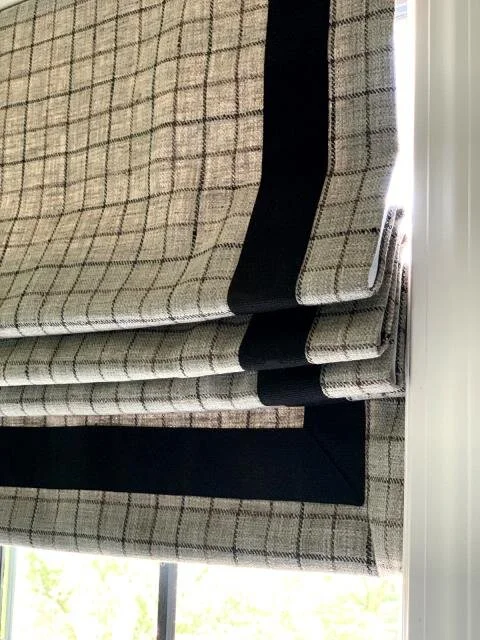
In another AFTER image of the master bath, Haneen added a custom Roman shade at the window. She selected a tattersall check fabric, banded in black velvet, fabricated by the Calico design shop in Novi, Michigan.
To see the full reveal story, visit Haneen’s blog post.
4. Susan Hill of Charlotte, North Carolina switched up a playroom to a gaming room for her teenagers
As a licensed interior designer who specializes in architectural design and construction, Susan Hill knew exactly what she was taking on in transforming a playroom that her girls had outgrown into a television and gaming room.
Susan Hill and the BEFORE playroom that had outlived its purpose after nine years. Those girls are now teenagers—and much more into gaming than into Barbie.
“When I asked my girls what room we should tackle for the One Room Challenge, both of them immediately asked for it to be the playroom,” recalls Susan, noting that her daughters and their friends are really into gaming now.
“Since the playroom space isn’t huge, there isn’t room for a pool table as there would be in some rooms. So, we are creating a warm, relaxed, techy space for all of us to hang out in.”
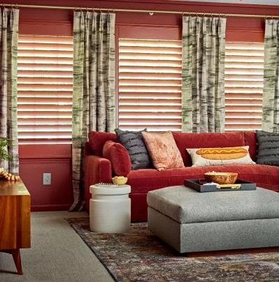
The AFTER family/gaming room features all new furniture, art, lighting, window treatments and a television wall—plus a beverage area and open storage cubbies for books and board games.
Photography by Dustin Peck; styling by Kendra Surface
Susan started by selecting a comfy sectional, upholstered in a brick-color velvet. She also wanted to pull in some gray colors (one of her daughter’s requests). A visit to the Calico design shop in Charlotte produced great results.
“Calico had the perfect linen for the drapery [Color Wash in Cinder], and it was a great way to pull in the charcoal gray with its pretty watercolor effect,” noted Susan. “So pretty and I love a European pleat, so that’s what we went with.” (At Calico, we call this a two-prong fan pleat.)
Left photo by Anna Morris; right photo by Dustin Peck.
To see the full reveal story, visit Susan’s blog post.


